







Overview
Team Analytics gives any group of members its own page, showing the whole group across personality, working style, strengths, and interpersonal style. Every member appears as an individual point rather than being folded into an average, so you can see the shape of the team and pick out any one person within it.
Each plot also marks the team average. Because every member is visible alongside it, you can always see who sits behind that average and who sits well outside it.
Any two teams can also be placed side by side on the same scales. See Comparing two teams.
Creating a team
Teams are built from tags. Every tag in your account is automatically a team, so there is nothing extra to set up: create a tag, apply it to members, and that group has a team page.
- Go to Tags in the sidebar and create a tag, for example Engineering, Leadership, or Sales
- Open a member from your member list
- Apply the tag in the Tags section of their page
- Repeat for each person who belongs on that team
You can also apply tags when you send an invitation or create an invite code, which saves tagging people one at a time after they join.
Tags can overlap. Someone tagged both Engineering and Leadership appears on both team pages, and their position is identical on each, because scores are always measured against the same reference sample rather than against the other people on the page.
The Teams list
The Teams page in the sidebar lists every tag in your account alongside how many of its members have finished their assessment, shown as "8 of 14 complete". That count tells you at a glance whether a team has enough results to be worth opening, or whether you still have people to chase. Select any row to open that team.
What the team page shows
A team page has four sections, one for each assessment area. Each section header shows how many members are included, for example "9 of 14 members", so you always know how much of the team a plot represents.
Personality
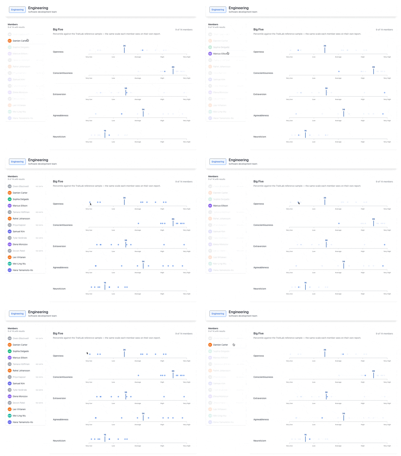
Five plots, one for each of the Big Five traits. Each member appears as a point positioned by their percentile against the TraitLab reference sample, the same scale each member sees on their own report. The vertical line marks the team average.
Working style
Six plots covering the career interest dimensions behind the working style archetypes: Realistic, Investigative, Artistic, Social, Enterprising, and Conventional. These are shown on the interest scale itself rather than as percentiles, and the panels always appear in that standard order so a team reads the same way each time you open it.
Strengths
A triangle plot placing each member between the three strength groupings: interpersonal, intrapersonal, and intellectual. A member sitting near a corner leans strongly toward that grouping, while one near the middle draws on all three fairly evenly.
Interpersonal style
A circular plot positioning each member by warmth and assertiveness. Alongside the individual points, this plot marks the team average and a dashed spread outline covering one standard deviation on each dimension, which gives a sense of how much the team varies. The spread outline appears only when a team has at least five members with results and there is variation on both dimensions.
Finding individual members
Every point on every plot belongs to a named person, and there are two ways to find out who.
- Hover a point. The member's name appears, along with their score on that plot.
- Hover a name in the member list. That person's point lights up in every plot on the page at once while the rest fade back, so you can follow one member across all four assessment areas.
The member list also works with a keyboard. Tab through the names and each member is highlighted in turn, which is often the fastest way to work through a team or to identify a point that overlaps with others.
Selecting a name opens that member's full individual results.
Comparing two teams
Any two teams in your account can be placed side by side on a single page, across the same four assessment areas. Both teams are measured against the same reference sample, which is what makes the comparison meaningful: a member's position means the same thing whether you are looking at their own report, their team page, or a comparison.
This compares two groups. To put two individual people side by side instead, see Comparisons.
Starting a comparison
- Open a team page
- Choose another team from the "Compare to…" box in the header, which lists every other team alongside its member count and how many have finished
- Select Compare
The team you started from is shown first and takes the first color. The swap control between the two team names reverses them, which changes only which team is drawn in which color and which side of the line it sits on.
What the comparison shows
The comparison page has four tabs, one for each assessment area, matching the sections on a single team page. Each team keeps the same color on every tab.
Every panel header reports each team's coverage separately, for example "Engineering 9 of 14 · Manager 5 of 7". This matters more here than on a single team page: four points with an average marker look just as confident as twenty, so it is worth checking how much of each team you are actually looking at before reading anything into the picture.
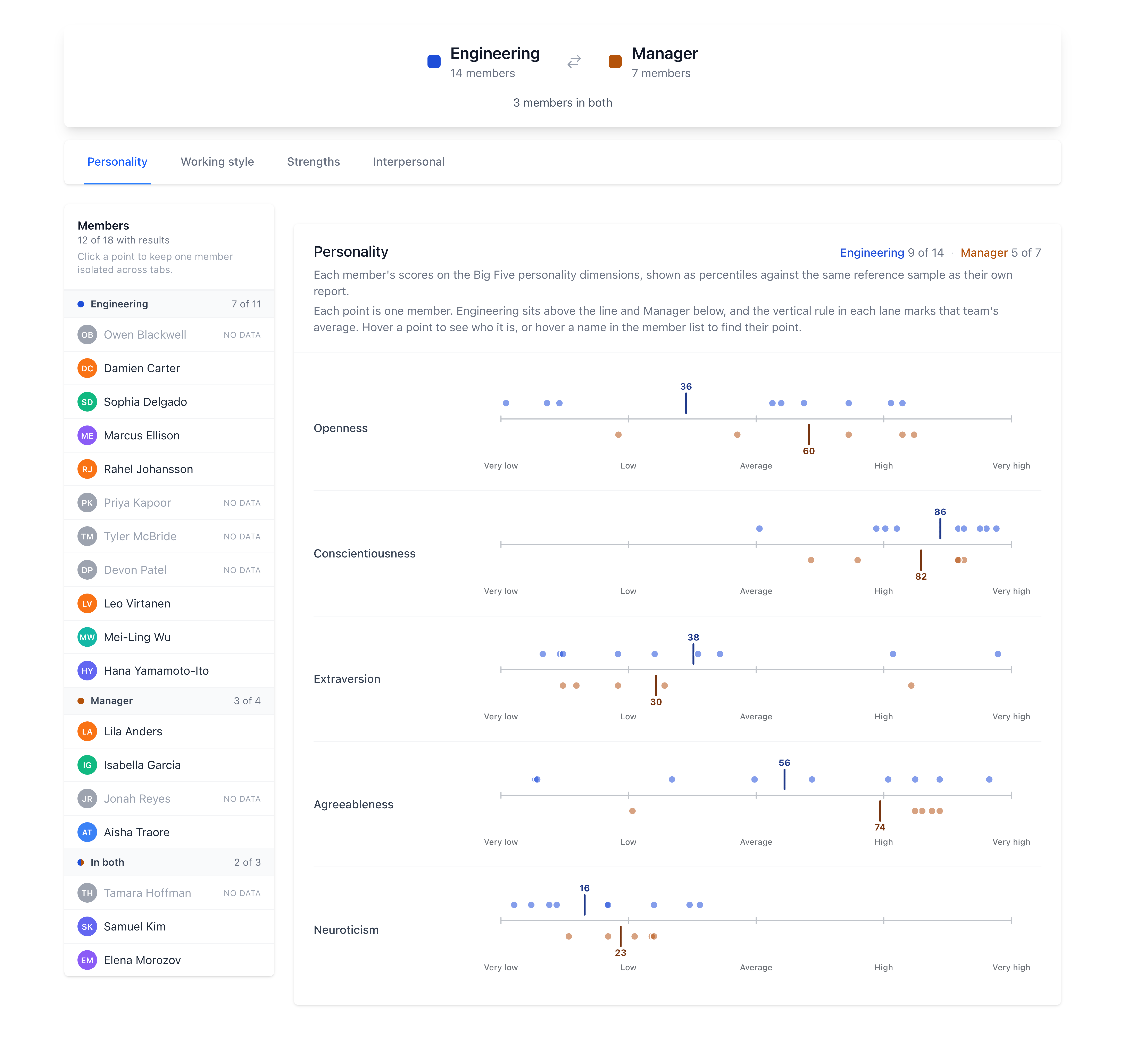
- Personality and Working style. Each plot has one scale shared by both teams. The first team's members sit in a lane above the line and the second team's in a lane below it, and each lane carries its own average marker. Two lanes rather than one mixed row means the two averages can never overlap, which is exactly the situation where you most need to tell them apart, and it means each team is identified by position as well as by color.
- Strengths. Both teams' members appear on the same triangle in their team colors, so you can see whether the two groups occupy the same region or lean in different directions.
- Interpersonal style. Both teams' members appear on the same circle, each with its own average marker and dashed spread outline. The spread outlines are drawn only when both teams have at least five members with results and there is variation on both dimensions. If only one team qualifies, neither outline is drawn, so a missing outline is never mistaken for an unusually tight team.
Members on both teams
Tags overlap, so the same person can belong to both teams being compared. Shared members are included in both teams' averages. This keeps a team's average the same number wherever you see it: a team's average on this page matches the one on its own page, no matter which team you compare it against.
How a shared member is drawn depends on the plot.
- Personality and Working style. The member appears once in each lane, in that team's color, because the two lanes are separate rows.
- Strengths and Interpersonal style. Here the member has a single position on the plot, so they are drawn as one point split into both team colors.
The member list groups everyone into three sections — each team's own members, and an "In both" section — and the page header always reports how many members the two teams share.
When teams overlap heavily
Two teams made up largely of the same people will always look similar, and any difference you see between them will be muted. A note appears at the top of the page when more than half of the smaller team is shared, and a more specific note appears when every member of one team also belongs to the other. Neither note stops you comparing; they are there because heavily overlapping teams look completely normal otherwise.
Finding members in a comparison
Hovering works the same as on a team page: hover a point or a name to light up that member and dim the rest. Because the four areas are on separate tabs, you can also select a point to pin that member, which keeps them isolated as you move between tabs. Select the same point again, or use Clear in the member list, to release it.
Members without results
A member only appears on a plot once they have completed the assessment that produces it, so the counts can differ between sections. Someone who finished the personality questions but not the career interest questions is included in Personality and left out of Working style, and each section header reflects that.
Members with no results yet still appear in the member list, marked "No data". They are listed rather than hidden so it stays obvious who is still outstanding.
Using team analytics effectively
A few ways to get the most out of a team page.
- Look at spread before averages. A team clustered tightly on a trait behaves very differently from one with the same average spread across the full range, and only the individual points show you which you have.
- Follow one person across all four areas. Hovering a name is the quickest way to build a picture of how a single member fits the group.
- Compare the same person on different teams. Positions are measured against the reference sample rather than the current group, so a member's point means the same thing on every team page they appear on.
- Use tags for more than departments. Any grouping worth looking at can be a team: a project, a cohort, a location, or a leadership level.
- Read a comparison for direction, not distance. A comparison shows you which way each team leans on a given dimension. It does not report a difference score, and that is deliberate: a figure like "+14" invites a decision that a descriptive picture of two groups cannot support. Read the direction, then look at the individual points behind it.
- Pick pairs that are genuinely different groups. Comparing two teams that share most of their members tells you very little, since both averages are built from the same people. The page flags this when it happens, but choosing distinct groups in the first place gives you a far more useful read.